A beautiful website is not always a high-performing website.
Many small businesses invest in sleek design, professional photography, strong colors, and polished branding. All of that matters. But if a visitor lands on your homepage and still has to figure out what you do, who you help, or what step to take next, your website may be costing you leads.
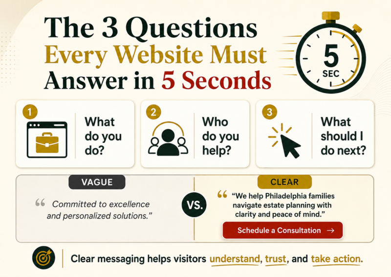
Here is a simple example.
Imagine a law firm with a clean, modern website. The homepage looks professional. The photos are sharp. The colors feel trustworthy. But the main headline says:
“Committed to excellence and personalized solutions.”
At first glance, that may sound polished. But it does not clearly answer the questions a real visitor is asking.
When someone visits your website for the first time, they are usually trying to answer three questions quickly:
- What do you actually do?
- Is this for someone like me?
- What do I do next?
If your website does not answer those questions in about five seconds, many visitors will leave. Not because your business is not good. Not because your services are not valuable. But because your message made them work too hard.
That is one of the biggest website messaging mistakes small businesses make. They use broad, professional-sounding language instead of clear, customer-centered language.
The phrase “committed to excellence” could describe almost any business. A law firm, accounting firm, dentist, contractor, consultant, or marketing agency could all say the same thing. But that kind of language does not help your ideal customer quickly understand why your business matters to them.
A stronger homepage headline should be specific, clear, and useful.
Instead of saying:
“Committed to excellence and personalized legal solutions.”
A law firm could say:
“We help Philadelphia families navigate estate planning with clarity and peace of mind.”
That headline is more effective because it answers the visitor’s real questions. It explains the service, identifies the audience, and speaks to the emotional outcome the customer wants.
Then the website should follow that headline with a clear call to action, such as:
“Schedule a Consultation.”
Now the visitor knows what the business does, who it helps, why it matters, and what to do next.
This is the difference between a website that simply looks good and a website that helps convert visitors into leads.
Your homepage should not make people decode your value. It should guide them. Clear website copy helps potential customers feel understood, see the benefit of working with you, and take action with confidence.
At Next Level DMS, this is why message clarity comes first. The Next Level Story Guide + Convert Kit is designed to help businesses put the customer at the center, sharpen their message, and create a simple playbook they can reuse across their marketing.
Before you worry about adding more content, running more ads, or redesigning your entire website, start with the basics.
Look at your homepage and ask:
Can someone understand what we do in five seconds?
Can they tell who we help?
Is the next step obvious?
If the answer is no, your website does not need more clever language. It needs more clarity.
And clarity is what helps customers move forward.